OSHA 1910.145 and ANSI Z535.2 are the two documents every warning-sign buyer has to read first, and they split the work cleanly: 1910.145 is the legal floor that US inspectors cite, while ANSI Z535.2 is the formatting blueprint the rule defers to for color, signal word, and symbol layout [S4][S5].
Warning sign selection in practice is a three-axis decision: signal word (DANGER / WARNING / CAUTION / NOTICE), color band, and the pictogram-plus-text block underneath. The regulatory text for the four ANSI Z535 signal words ties the word to two variables, severity of potential injury and probability that it will occur, and the choice that fails this two-factor test is the choice that gets cited [S2][S6].
Signal-word matrix: severity multiplied by probability
ANSI Z535.2 reserves DANGER for hazards that will cause death or serious injury and where the probability is high; OSHA 1910.145(c) phrases the same condition as an "immediate hazard" that "will" result in death or serious injury, so the two documents are aligned in wording even though only OSHA carries citation weight [S4][S5].
WARNING is the middle band: serious-injury potential exists, but either the severity or the probability is reduced compared to a DANGER condition; typical WARNING applications include 480 V disconnect cabinets behind a locked door or automatic press cycling zones that already have a light curtain [S2][S6]. CAUTION is limited to minor or non-life-threatening injury, which is why many plant policies restrict CAUTION to housekeeping hazards, trip edges under 4 inches, and low-temperature equipment surfaces [S2][S3].
NOTICE is not a hazard header at all under 1910.145; it is the blue property-damage / general-information header used for "AUTHORIZED PERSONNEL ONLY" or "EYE PROTECTION REQUIRED BEYOND THIS POINT" copy that does not signal injury severity [S2][S4]. Buyers who tag property-only messages with a red DANGER header create two problems at once: they dilute the meaning of DANGER, and they fail the ANSI color-code test on first inspection [S4].
Color, header, and pictogram: the design pillars
The four header colors are standardized: red panel with white "DANGER" text, orange panel with black "WARNING" text, yellow panel with black "CAUTION" text, and blue panel with white "NOTICE" text, with green reserved for emergency egress and safety equipment location signs [S4]. Each color carries a fixed meaning, so a yellow CAUTION sign that says "HIGH VOLTAGE" fails the color-severity test before any inspector reads the body copy [S4][S6].
Every sign that complies with ANSI Z535.2 stacks five elements in the same order from top: signal word, pictogram, hazard statement, consequence statement, avoidance action. The pictogram should follow ISO 7010 graphic conventions whenever clarity improves recognition speed, which is most of the time on a busy plant floor [S4].
Text legibility is the second non-negotiable pillar: 1910.145 requires wording that is "concise and easy to read" for the average person in the hazard zone, and OSHA inspectors will measure the distance from sign to viewer against the text height when they walk the floor [S5]. A rule of thumb that holds up in audit is roughly 1 inch of letter height for every 25 ft of viewing distance, but the binding number is the one your AHJ enforces locally [S4].
Where warning signs fit, and where they do not
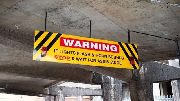
Warning signs are the right call for hazards that can kill but that are not certain to kill on contact, which is the largest single band on a typical plant risk register. Examples that consistently map to WARNING rather than DANGER include automatic robotic cells with a verified light curtain, overhead crane paths under load, and 480 V panels inside a locked electrical room [S2][S4].
Warning signs are the wrong call for two large categories: immediate-death hazards, which legally require DANGER, and minor-injury or property-only hazards, which are CAUTION or NOTICE respectively [S2][S6]. A common audit finding is the overuse of DANGER on lockout points and 120 V outlets, which trains workers to ignore the red header and burns the very cognitive shortcut the sign is supposed to trigger [S4].
For chemical-room entries the relevant additional rule comes from the laboratory standard and from Proposition 65 in California: a CAUTION sign has to be posted at the entrance of any space where hazardous materials are stored or used, and a separate WARNING sign covers the additional health hazards that exist inside [S1][S3].
Material, mounting, and the 2026 buying checklist
Sign substrate should be matched to the chemical and UV exposure it will see: aluminum (typically 0.040 in to 0.080 in) for outdoor general duty, PVC or polycarbonate for indoor washdown, and adhesive vinyl only as a temporary or indoor-medium solution. Adhesive-backed vinyl generally fails inspection within 12 to 24 months on outdoor assets because the color shift and edge lift break the legibility rule of 1910.145 [S4].
Mounting height is set by viewing distance, not by tradition: the sign should sit inside the normal line of sight at the point of approach, typically 60 in to 66 in centerline for standing-height reading and lower in overhead-crane paths so the text faces the operator at cab height. The Proposition 65 symbol rule is a useful proxy for size, since it ties the warning symbol to the cap height of the word "WARNING" rather than to a fixed mm value, and the same proportional logic keeps ANSI Z535.2 text in spec [S1].
For 2026 procurement, a defensible shortlist logic is: (1) classify each hazard by severity x probability and assign DANGER / WARNING / CAUTION / NOTICE; (2) match the header color to the signal word and lock the pictogram library to ISO 7010; (3) size text to the verified viewing distance using 1 in per 25 ft as the audit-safe baseline; (4) pick substrate to the environment, aluminum outdoors, PVC indoors, vinyl only as temporary; (5) plan a 12-month inspection cycle because UV, chemical attack, and abrasion will degrade the message long before the substrate fails [S4][S5].
Common failure modes and how to avoid them
The four failure modes that show up in OSHA citations repeatedly are wrong signal word, wrong header color, illegible text at the actual viewing distance, and missing avoidance action. Each one is fixable at specification time, which is why the audit always starts with the sign register rather than the shop floor [S4][S5].
Buyers should also avoid treating warning signs and warning tape as substitutes: tape is for temporary or geometric marking (floor boundaries, overhead lines, buried utilities), while a sign is a fixed hazard communication that survives a 12 to 24 month inspection cycle. The two products do coexist, however, and a useful cross-reference is the height-work spec map for warning tape selection at elevation, which shares the same ANSI Z535 viewing-distance logic.
For facility buyers who also manage machinery, the warning sign sits inside a wider safety-controls stack that includes interlocks, e-stops, and safety relays; aligning the warning sign with the emergency stop category and PL target keeps the visual and electrical layers telling the same story, and a parallel check on the safety relay PL/SIL targets confirms the risk assessment is consistent end to end. PPE-side decisions, including safety glasses markings and lens selection, should be reviewed against the same sign register so the verbal "EYE PROTECTION REQUIRED" copy points at a real, stocked PPE supply.
Spec-level background on the components involved: warning sign, and pressure transmitter.